Homepage — desktop
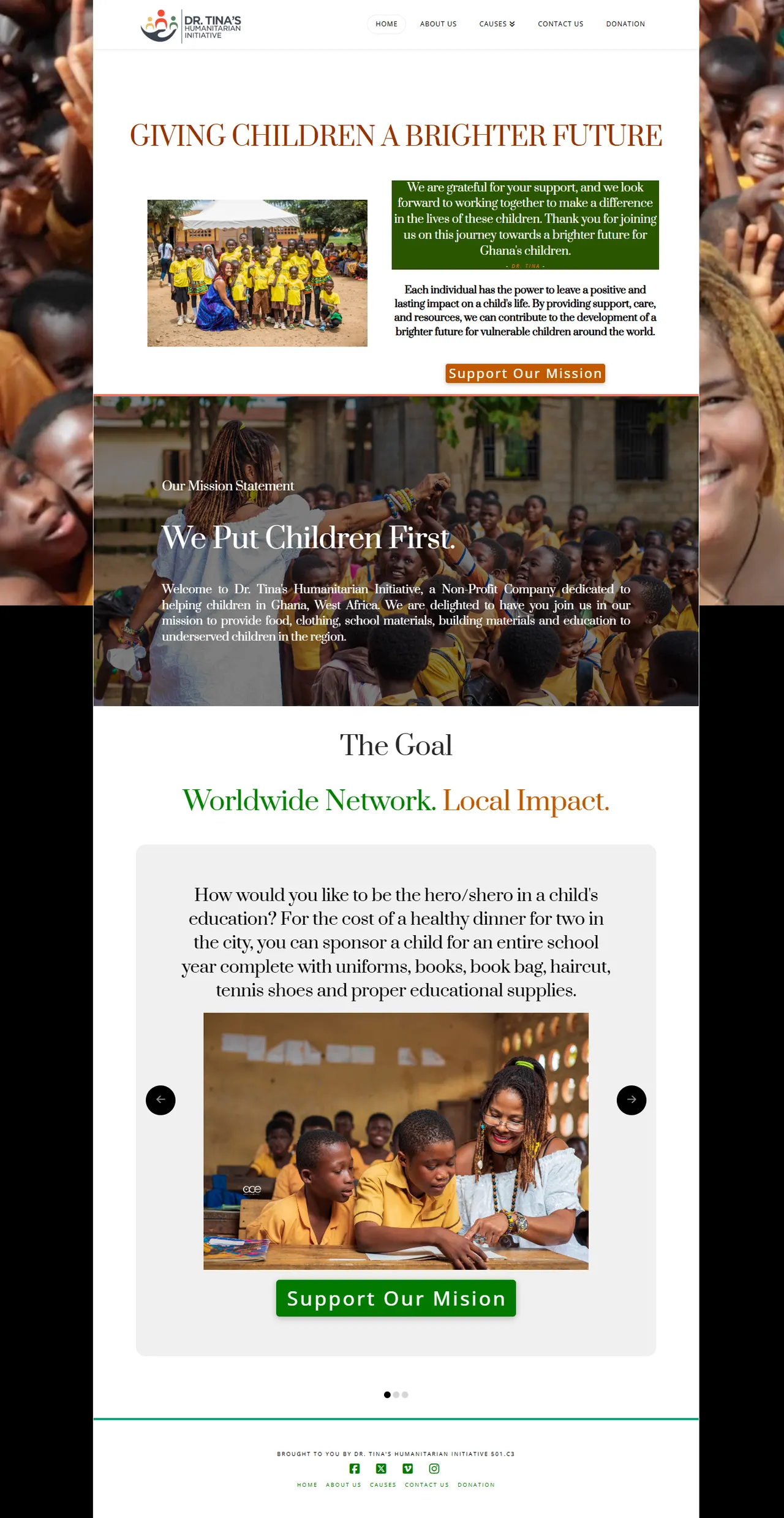
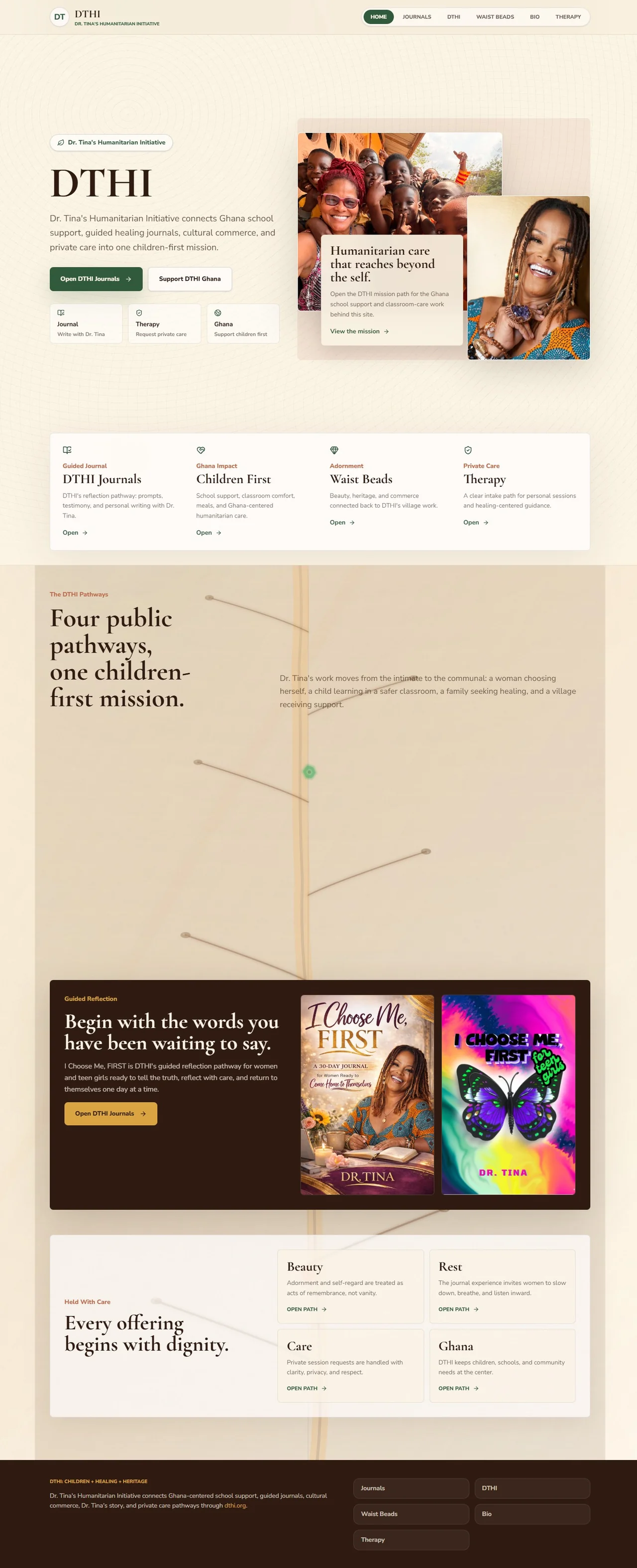
Public website case study
Dr. Tina Health Initiative had a real public mission and real material to share. This redesign focused on clearer hierarchy, easier scanning, and a more direct mobile reading path. These screens document the work; they do not claim unmeasured outcomes.
Focus
Clearer story and page hierarchy
Evidence
Captured public before-and-after screens
Constraint
No invented traffic, donation, or revenue claims
Compare the public pages
Homepage — desktop
Homepage — mobile


The opening area gives the initiative's purpose more immediate visual weight and a clearer first read.
Content is grouped into a more deliberate public sequence so visitors can scan the mission and supporting proof with less friction.
The mobile comparison documents that the responsive path was part of the redesign rather than an afterthought.
This case study stays factual: it shows the pages and design intent, without claiming analytics that were not measured.